Energex
We supported Energex as they embarked on building a new company – a consultancy offering an authoritative perspective on the energy industry.
Sparks was involved from an early stage to help with positioning and branding for the new venture.
The Energex service offer and business model are complex. Our challenge was to make it easy to understand, avoiding jargon and insider language.
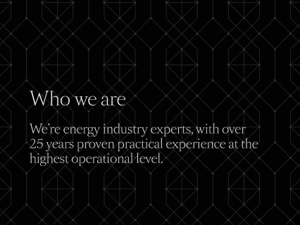
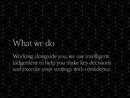
We wrote a distinctive brand foundation and came up with bold headlines and supporting copy for the website.
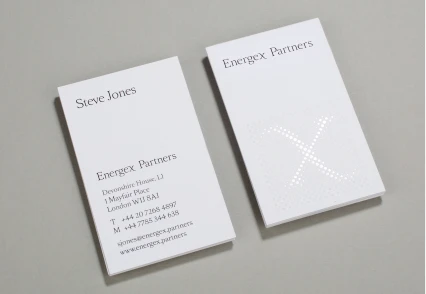
We used a traditional typeface and a classic black and white colour palette to suit the sophisticated and serious nature of the business. The patterns used across the website, stationery and presentations are based on molecular structure. The connecting dots represent the gaps in expertise filled by the Energex team.
