The Ruffer Review
Services
- Editorial Design
- Art Direction
- Illustration
- Digital Campaigns
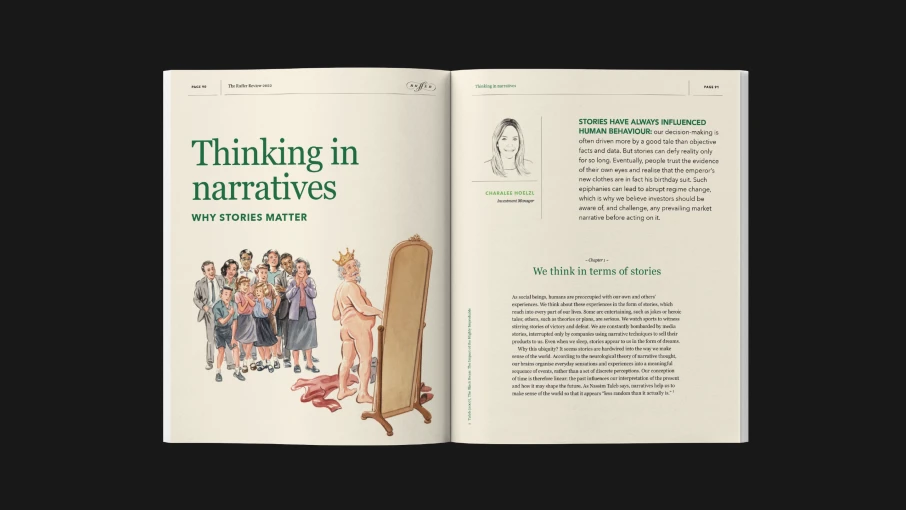
Many investment reports are dull in tone and design with endless columns of text, charts and tables.
We designed the Ruffer Review to be far more engaging, one that shuns the average and formulaic. The Review allowed us to broaden and strengthen the firm’s vision and output. Throughout our helming of the review it has become a distinctive publication that people recognise as an important and cherished part of Ruffer LLP.
Opportunity
Whilst working with Ruffer LLP, Sparks have been entrusted with their coveted Ruffer Review. Working closely with their communications director we established how they wanted to shine a light on the investment team and their depth of thinking. Which led to the ambition of the Ruffer Review.
The goal is always to entertain and inform. More dinner party than party manifesto and act as a thoughtful counterpoint to the chairman’s quarterly updates. It also had a deeper purpose: to convey that Ruffer is a collective of sharp, independent thinkers, not a one-man investment style.
Over the years, Ruffer’s performance has often diverged from industry peers. But for this 25-year-old firm, that’s never been the point. Consistency, discipline, and independent thought have always mattered more.
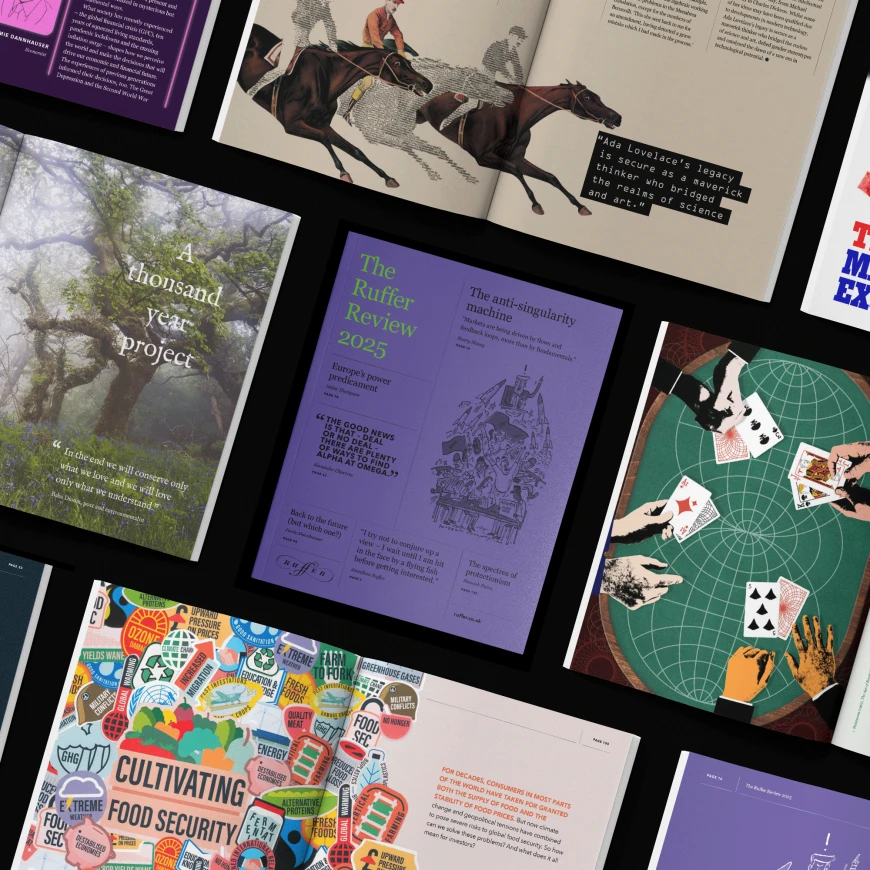
2025
"Markets are being driven by flows and feedback loops, more than by fundamentals."

Design
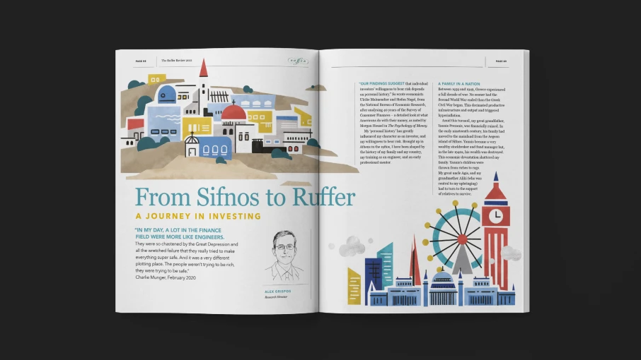
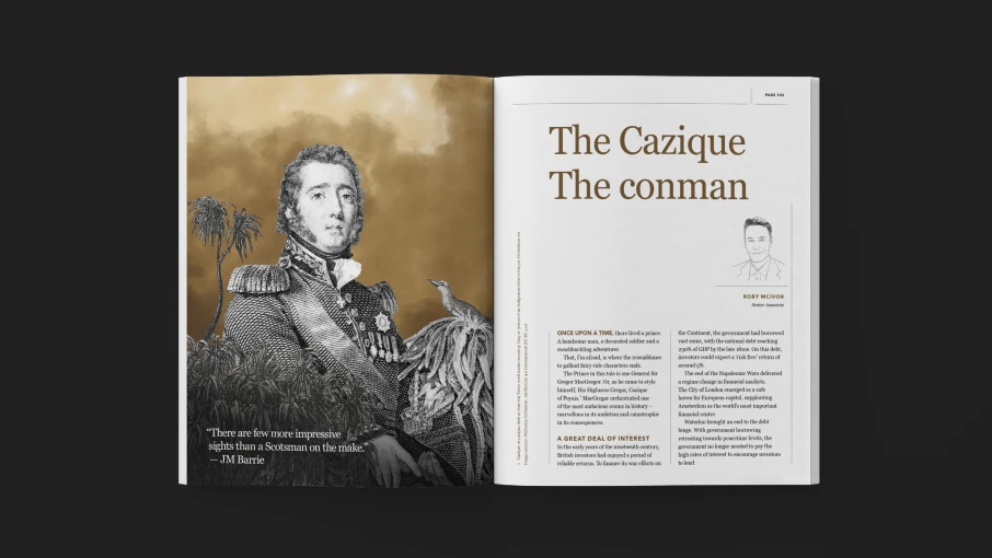
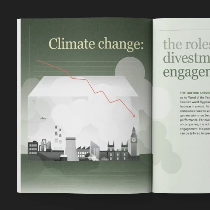
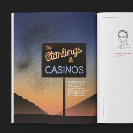
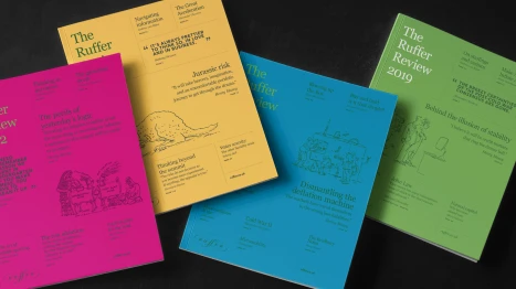
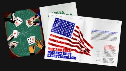
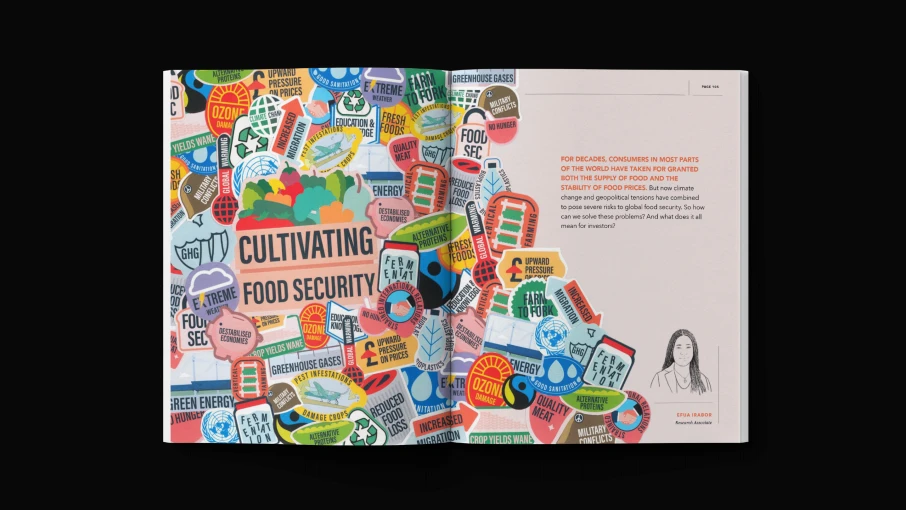
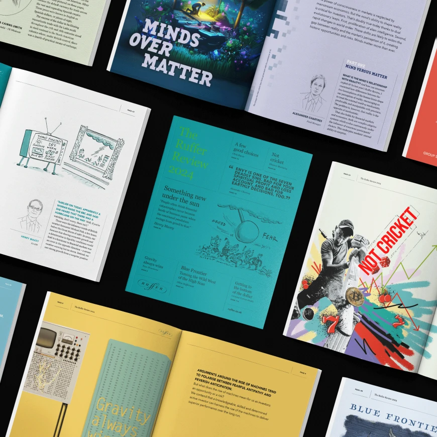
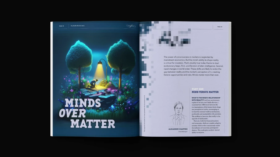
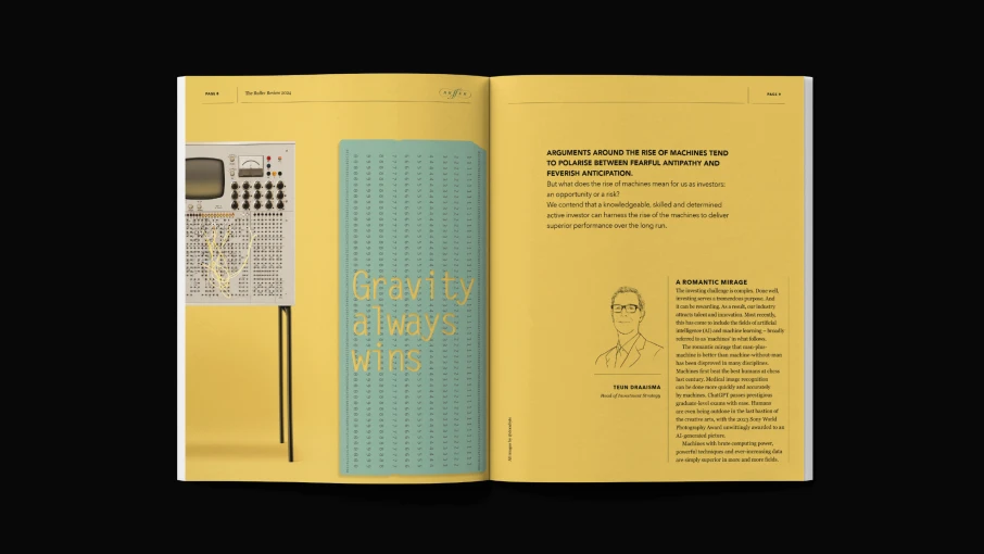
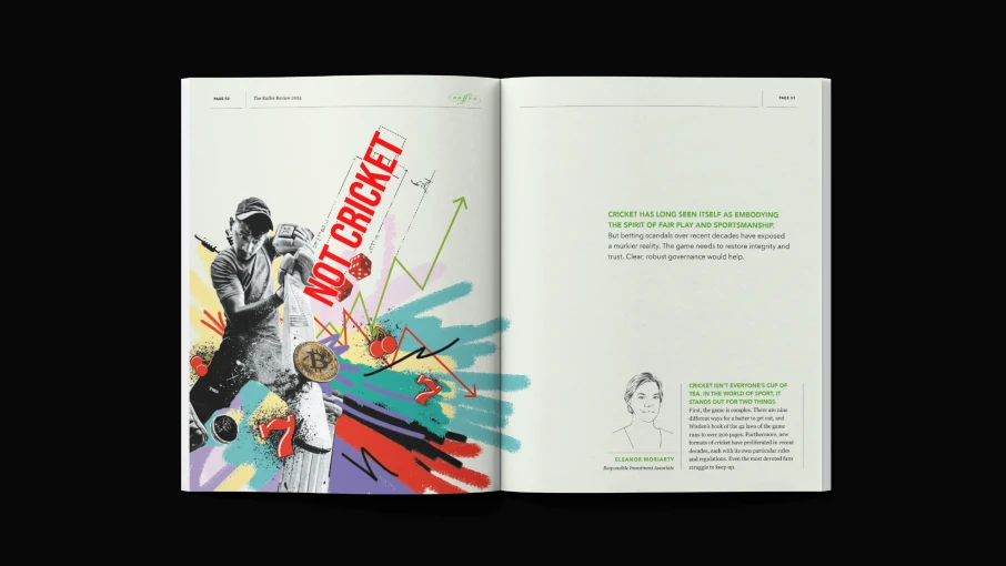
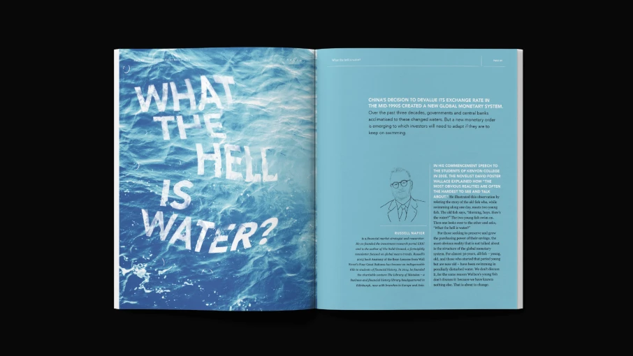
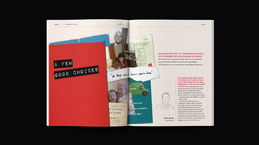
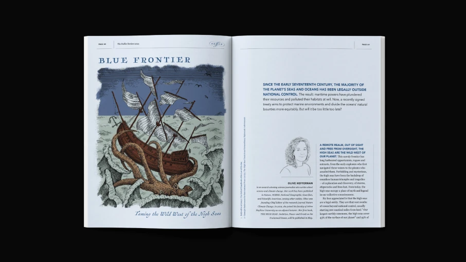
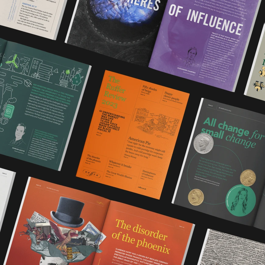
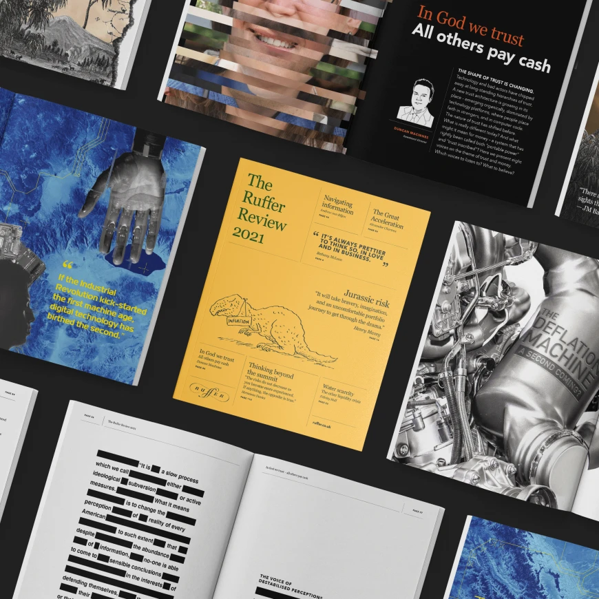
Each issue across its 100 pages cover a range of topics presented by an array of authors. Articles are treated individually, developing ideas, moodboards and styles. We then commission illustrators and image makers as well as using some of our own wizardary.
The Review is a refreshing and brave departure from the bland mainstay of investment reports. With its high production finishes the publication. It’s have become a mainstay element of Ruffer’s offering and a coveted tome of idea going out to over 10,000 people per year.
2024
"People often think financial catastrophes occur because herds of humans panic when the emotional pendulum swings from green to fear."
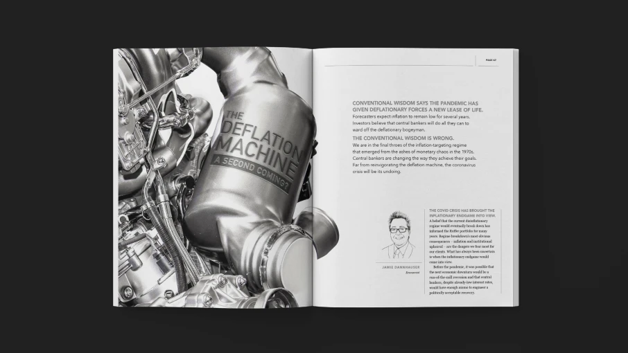
2023
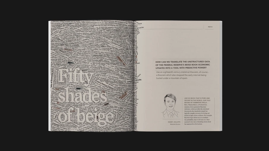
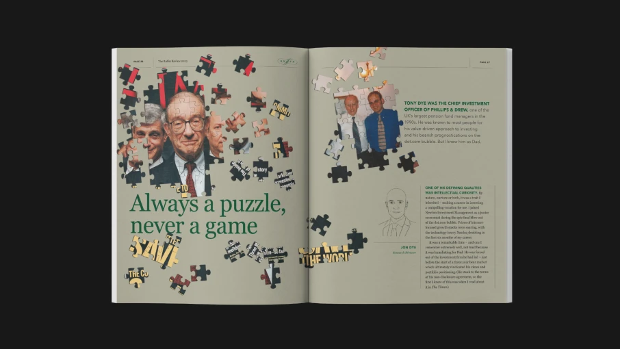
"Understanding the market was like doing a 10,000 piece jigsaw puzzle made entirely of black pieces."
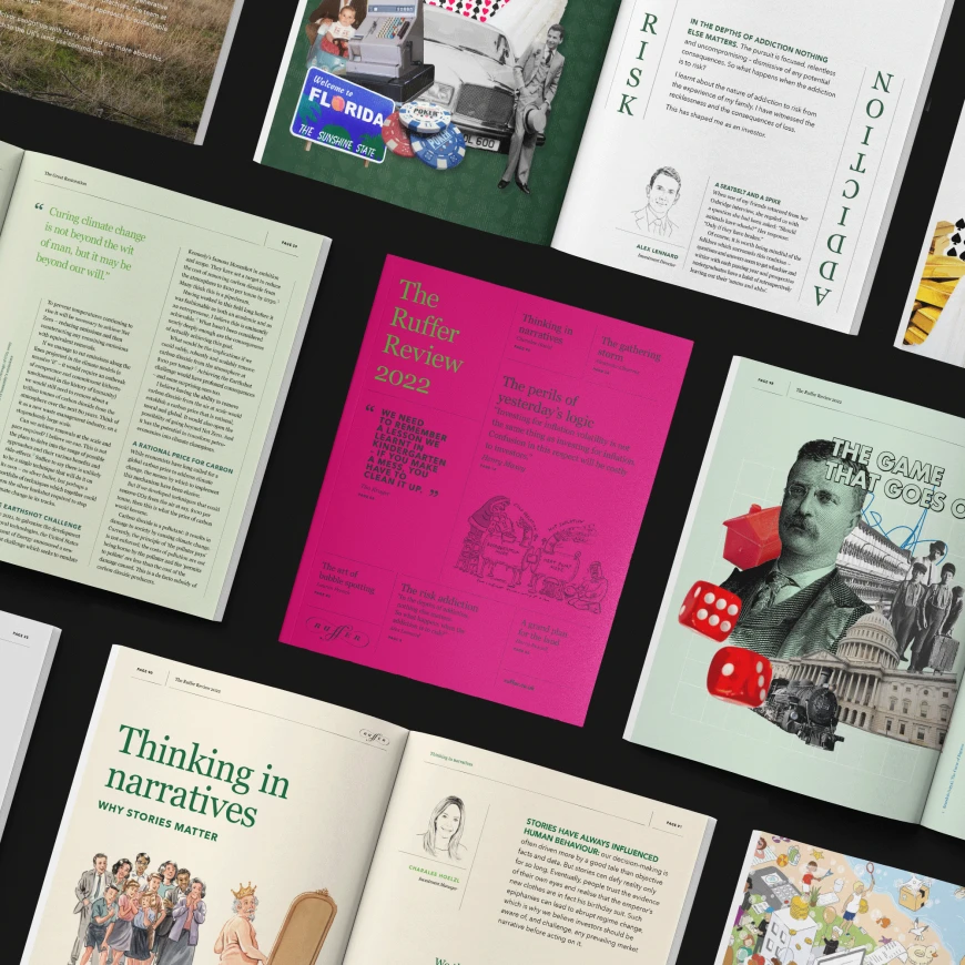
2022
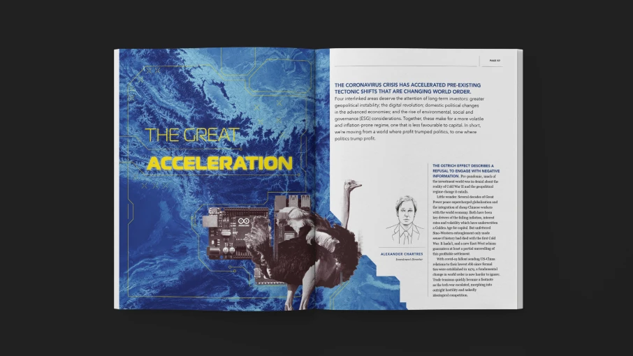
"We need to remember a lesson we learnt in kindergarten – if you make a mess, you have to clean it up."
2021
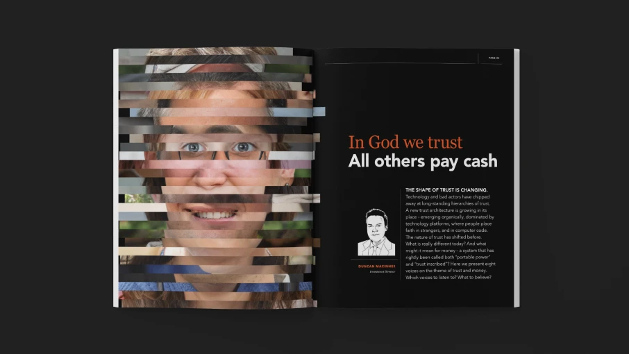
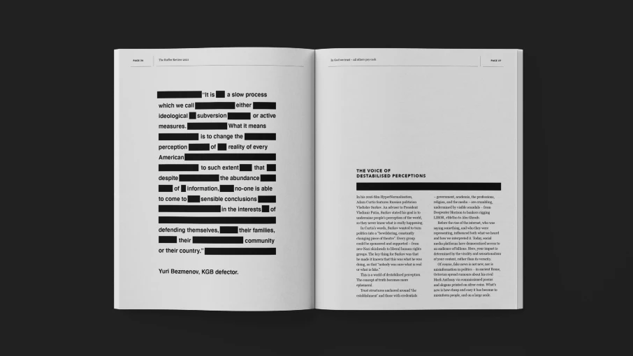
"The risks do not decrease as you become more experienced. If anything, the opposite is true."