Theos Thinktank
Theos
- Brand, Design, Web development
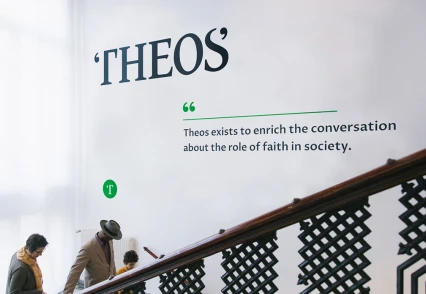
Bringing an enriching voice to life
Theos, the influential think tank, widely recognised for its balanced approach to faith in modern life, came to Sparks in 2016 with a weighty challenge.
The organisation had built a strong reputation as approachable, rigorous and insightful, but their visual identity and online experience hadn’t kept pace.
Discussing faith and its impact on society can be a tricky subject. We have previously worked with Christian Aid and the Bible Society and had some idea of the challenges faced by religious organisations trying to engage a contemporary audience. A 2015 NatCen survey* into British social attitudes showed that almost 50% of Britons claimed no religious status.
A strong heritage, an authentic desire to stay relevant and ambition to reach beyond their existing audience? That’s exactly the kind of challenge we like at Sparks.
Opportunity
The organisation had built a strong reputation as approachable, rigorous and insightful, but their visual identity and online experience hadn’t kept pace.
Discussing faith and its impact on society can be a tricky subject. We have previously worked with Christian Aid and the Bible Society and had some idea of the challenges faced by religious organisations trying to engage a contemporary audience. A 2015 NatCen survey* into British social attitudes showed that almost 50% of Britons claimed no religious status.
A strong heritage, an authentic desire to stay relevant and ambition to reach beyond their existing audience? That’s exactly the kind of challenge we like at Sparks.
Review
Building knowledge for a strong foundation
We started with an exploration of Theos’ ambitions, interviewing stakeholders and senior management to gain the insight needed to define a new visual identity. For some participants, this stage of the process can be frustrating – they are impatient to see the logo – but it’s a vital step in agreeing direction and establishing a strong foundation.
Define
Establishing clarity and simplifying well
Our next stage was to translate everything we learned from the Review process to a clear, concise brand foundation – to simplify well. We presented a range of positioning statements, positioning summaries, brand characteristics and expanded brand statements. Working with Theos, our team refined these to a single, agreed point of view. The essence of the Theos’ brand should be built from their active, enriching voice.
Design
A clear, engaging visual identity
Through the design stage we explored a range of visual directions. Our Initial sketches were discussed and developed by the team. Each direction was measured against how well it represented the brand’s essence – an active, enriching voice.
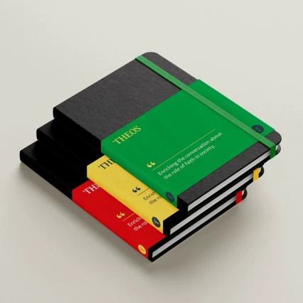
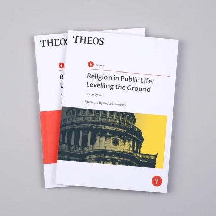
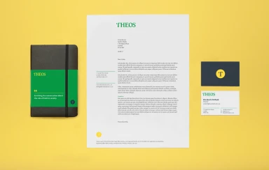
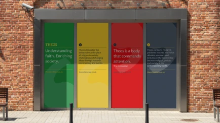
We shared our most successful directions with the client. A clear favourite emerged as discussions developed. The preferred route added quote marks to the start and end of Theos. The logo is a custom wordmark based on Gentium, an open source serif typeface designed for readability. We brought this together with a vibrant and balanced colour palette to add energy and dynamism.
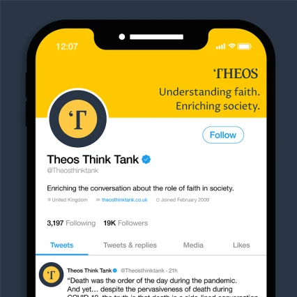
We also created a symbol using the ‘T’ of Theos in a strong, round frame for use in small spaces, particularly digital screens.
Create
Brand guidelines, website and collateral design
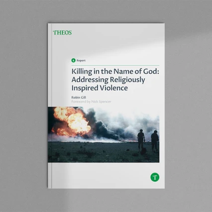
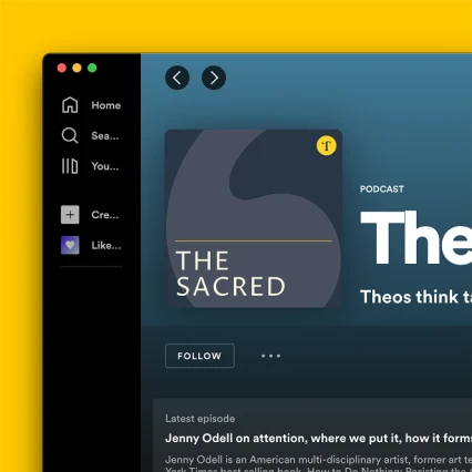
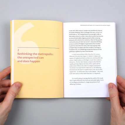
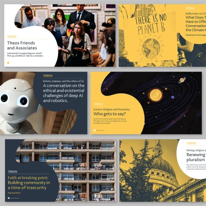
In the final stage, we defined the brand guidelines for Theos and applied the new identity to a range of collateral. We redesigned and optimised the website to help Theos present a more engaging digital platform and clearer user experience.