Fluid IT
Services
- Brand Strategy
- Visual Identity
- Website Design
- Art Direction
Photography
- Jason Ashwood
An IT solutions company that’s as much about people as it is about tech.
FluidIT are an IT solutions company and a founding member of B–Corps in the UK. They began in 2005 as a small company specialising in affordable IT support for charities, and the firm has grown and developed around a core idea: that business can be a force for good in the world.
FluidIT approached Sparks expecting more than a visual refresh to their brand. They wanted to get to the core of who they are, with a brand that articulated their social mission as well as their professional services.

Challenge
From the start, FluidIT have operated on the principle that people are more important than profit. Nothing is more important than helping people to flourish and be their best. That includes staff – the company’s first hiring was an ex–offender with no IT experience, and they have continued to invest in the wellbeing of employees.
That strong social focus is also good for clients. Fluid IT recognise that every time somebody calls up for support, you’re dealing with a person and not just a computer. It’s personal. When you fix their problem, you set that person free to do what they do best.
The challenge for us was to capture this distinctive ethic and communicate it in a compelling way, in the crowded IT services space.
Action
Sparks carried out an extensive review of the organisation and its existing brand, conducting interviews with staff, stakeholders and clients. It was clear to us that the service and the social mission were not to be held in tension. They enhanced each other – it was all about releasing potential.
With this in mind, the new brand highlights company values that had often been overlooked while focusing on services and technologies. We led workshops to help the team to refine their identity and distil their distinctives, and then worked up a series of possible approaches.
We also directed a photo shoot on the premises that captured staff at work, focusing particularly on moments of collaboration and discussion.


Results
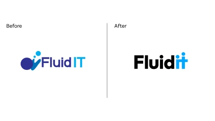
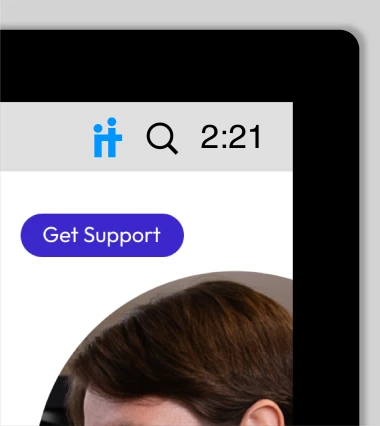
Rather than radically re–invent FluidIT’s visual identity, the brand built on existing colour schemes and ideas while updating the typography. The most significant design element is small but powerful: the addition of a dot above the T in IT. This immediately suggests people working together, and encapsulates the company’s people–first approach in simple iconography.
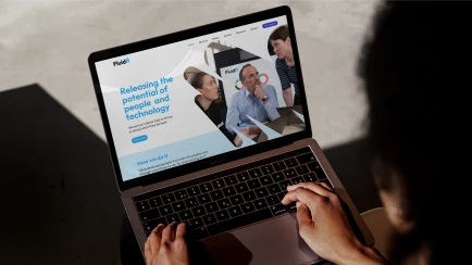
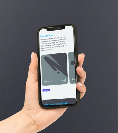
Smooth and flowing supporting graphic devices hint at the liquid nature of the company name, and reference the splashy logo of the old brand. These flowing shapes serve as frames for the photography on the new website, which brings people and relationships to the foreground.
The end result is a fresh and distinctive brand for a unique and inspiring IT firm.